12 December 2011

How To Evaluation


The problem we identified in our group was 'How to Make Christmas Dinner Less Stressful'. This was a more focused 'how to' than the one we discussed in our progress crit, which was 'How to save money and time at Christmas'. We were told to really refine the idea, which helped to give us more focus for the end product. 
In terms of evidence for our 'How To', it's a well published fact that Christmas, and Christmas Dinner in particular can be a very stressful period for adults, who are given the responsibility of preparing the whole meal, which takes up a large portion of the day. There are television shows and pages and pages of magazines devoted to the Christmas meal. 
As a group we also took surveys asking people for their opinions of it, and all agreed it was a very stressful task. 
We collected various research to inform us during this brief, including surveys (primary quantitative and qualitative) which gave us provable data, and also the opinions of our main target audience, female adults. We also gathered secondary qualitative and quantitative research, which included looking at price comparison websites to look at the difference in price between various christmas dinner items (however this was in conflict with our idea of saving time) and also at various cookery websites and blogs to look for people tips on how others lessen the stress of preparing Christmas dinner. 
These tips taken from secondary research helped us the most because they gave us inspiration for what we needed to include in our final product. As a group and singularly I feel like our final product was well informed by our research, and I think although we could have done more research, we had a large and varied amount of information to work with. 
If we'd had more time, I feel like I could have collected more primary and secondary quantitative research, but due to the nature of the question we were answering, our main research needed to focus on collecting qualitative research. Perhaps we could have asked more people for their own personal tips and recipes on making Christmas dinner to give us a greater scope. 
Researching our 'How To' took quite a lot of time, and we possibly focused too much on generating research as opposed to coming up with design resolutions in the first half of the brief. I also struggled to come up with a clear concept regarding making Christmas dinner less stressful. In terms of format, we wanted to create something that was relevant and useful, so that people wouldn't just throw away whatever we gave them. 
Our main focus for the product at first was to create something very light hearted that was based on the idea of joke tips for lessening stress at Christmas. We began with creating 10 tips as a group, and went onto develop design solutions for each one separately. The tips included 'going to a restaurant' or 'having a liquid lunch' which were informed by tips we found online from both women and men. 
I tried out several design solutions that focused on recipe cards. One side would be the joke tip, whilst on the other side would be a recipe for an element of Christmas dinner. My design solutions were mainly type based, and the colours and typefaces I used were more directed at a female audience, because I felt that women are the ones who are usually responsible for preparing dinner. As a group we each discussed our designs, and whilst the group liked them, we were struggling to find a way to make sense of the idea, in line with the serious tips we had found the could actually be useful as a handout. 
We then went onto develop the idea of a flip card format, that binded 10 recipe cards together, and also a card filled with both serious and jokey tips. This was inspired by the idea of the main tip being 'Be organised'. The recipes are placed in a chronological order in terms of preparing the meal, and the recipes we used are easy to follow and make. The flip card idea worked well because it means that you can place it in the kitchen and read the recipes propped up. It also takes up a lot less space than a normal recipe from a magazine or book. 
My main contribution to the group was the front page, the fronts of the recipe cards, and also the card including the tips. 

Design Possibility
Design Possibility
The outcome of these looked typically festive, and the palette used was green, red and a light pink. We used a mix of both a simple, bold typeface (Bebas Neue), and a more feminine and classic typeface (Otama Ep), to create a balance. The information presented was also quite simple, with only a few small and simple illustrations, and minimal text on the front of the recipe cards. I thought this worked well because it created something that looked visually intriguing, so that people would want to pick it up in the supermarkets and look through it, as opposed to overloading it with information which I felt would have deterred people. 
Final Design Resolutions

I feel like the end result was very suitable to the supermarket and christmassy environment in which it was being distributed, and it also provided something very useful, as all the information you need is provided in something small, compact and easy to follow, whilst still being quite stylish and aesthetically pleasing. 
I feel like I contributed well to the group, although I do feel like at times I could have been a little more restrained when putting ideas and opinions across when it came to the design process. Despite a bit of a struggle with the concept, I feel like our team worked well together and we really came through for the final product and presentation. 

List five things that you have learnt about the design process over the last two weeks.
  • The design process is cyclical, and research is always valuable in whatever stage of the process you are at
  • Quantitive research is key to identifying and understanding the target audience you want to communicate with.
  • It's important to create final design solutions as a group so that there is a level of consistency when it comes to creating the final product.
  • Making sense of research early on is vital to providing a fully resolved solution if you have a short space of time to complete a brief. 
  • The larger the amount of research you collect, the better informed you will be.

List five things you would do different next time
  • I would want to do more intensive researching earlier in the process, allowing more time to develop an informed concept and design solutions, whilst continuing to go back to research at suitable times. 
  • Collect more primary quantitative research
  • Try to use different source material for collecting secondary research, instead of repaying too heavily on the internet. 
  • Try to work with a more innovative approach, by trying to include illustrations and perhaps experimenting with different formats.
  • Manage time more efficiently. 

    9 December 2011

    WOAH.

    Competition brief to create a Christmas E Card for the College, that gets sent out to people they work with in the community. 


     My entry for the competition. I wanted to keep it simple and festive, so I used typically Christmassy colours and the typefaces used were Ribbon, Weston Free and League Script Thin. The ribbon typeface worked well because it links well to wrapping Christmas presents up.
    Aside from raffle prizes and high school spelling contests (yes, really), I've never won anything before!
    This is exciting!

    20 November 2011

    Design Skills Evaluation

     What skills have you developed through this module and how effectively do you think you have applied them?
    Thanks to the short briefs, I think I've developed the ability to generate ideas and concepts quickly, which I know will be expected of me in a professional environment, and whereas previously I would have been distracted or unmotivated, I've found it really easy to concentrate and focus on the brief, so that all my work is being produced in good time. 
    The crits we have undertaken have helped to develop my critical and analytical skills, in regards to both mine and my peers work, but also in the greater context of the graphic design industry. I now have a broader vocabulary in terms of analysing people's work, and I also have a greater understanding of how to provide useful feedback. 
    Blogging regularly during this module has also developed my writing skills, and has helped me to better articulate my ideas and my thoughts on my own work. 
    The Illustrator brief has introduced me to software I had no previous experience of, and I now feel I am more digitally competent, and I have a greater level of confidence on the adobe software, although I know I have a lot of work to do to catch up with my peers when it comes to digital design.  

    What approaches to/methods of idea generation have you developed and how have they informed your design development process?
    My brainstorming skills and design sheets have developed strongly in my time here, and I am now able to create a higher quantity of design sheets filled with ideas and thoughts. In the mail shot brief, creating mock ups early on in the process was something I have never done before and something I found to be really useful in informing my ideas, as it allowed me to work out which ideas would work in reality and not just in my head. It also gave me a better idea of stock and how you can manipulate materials. 
    The progress crits have also developed my idea generation in a really positive way because I am able to get great feedback from people whose opinion I trust, and their ideas help to push me in the right direction, and allow me to see my work from a different perspective.  

    What strengths can you identify in your work and how have/will you capitalise on these?
    One of my main strengths I feel has been in generating ideas and concepts for each of the briefs. I always feel like my work has been well thought through and has a clear cut idea behind it. 
    Of all the briefs, I feel my strongest work was my personal alphabet for Stephen.  It was challenging, but I was very proud of my developments during the brief, and of the final resolution, which let me show off what I think is one of my main strengths - illustration and hand rendered design. I hope to start including more hand drawn illustrations within my work, as currently I don't feel like any of my work has been identifiably mine, aside from the personal alphabet. Everything else I've produced has been quite uniform and basic. 
    I also think another strength I have is in my communication and ability to create something high impact. I often find myself coming up with the text to go on a design before I think of the imagery, and I feel like I have a good understanding of audience and client, which helps me to set an appropriate tone within my work, both with any text used, and the colour and design. I'm hoping I will be able to capitalise on this strength throughout the course, as successful communication is the basis for successful design. 

    What weaknesses can you identify in your work and how will you address these in the future?
    I often worry when I look at my final resolutions that my weakness is in the execution and realisation of my ideas. I (generally) have no problem producing a concept or an idea for a brief, but I find it a struggle to bring the idea to life in the way I had imagined it would look, something I feel is in part due to my thought process. I find it difficult to approach things with a logic I know is necessary in professional graphic design, and in the next module, I am going to focus on improving this, and hopefully approach briefs with an improved mindset, as I feel this will improve the quality of my work. 
    I also want to try and challenge myself more in the next module, as much of my work has been very simple and straightforward design wise, and maybe a little obvious. 
    I would also like to work on the presentation of my design sheets, as I feel the standard of them slips part way through the brief, when I am working quickly and I do not think about making them look neat and tidy. 


    Identify five things that you will do differently next time and what do you expect to gain from doing these?
    I will create neater and more presentable design sheets, so that I can have a clearer plan of what needs to be done, and also so that my work is communicating clearly, which will affect my work in a positive way.
    I will spend time on illustrator and CS5 tutorials, which I hope will broaden my design skills so that in future briefs I can experiment and challenge myself a little more.
    I will write down plans for what I intend to do so that I can make it clear for myself, and I can start to work on things more logically, which means I will be better prepared.
    I will explore a wider range of design possibilities and experiment more with colour, type and image, which will benefit my work by giving me a broader range of ideas to work from.
    I will ask more questions in the crits we have so that I can better understand my work and the direction I need to take, which means my work will look better resolved. 


    7 November 2011

    Crit Sheet/Feedback Questions


    Amber's workshop, focusing on the actions and issues raised in the progress Crit, and also a prep for the questions me and Tom will be asking to help us discuss and give feedback for the Final Crits on Friday. 

    2 November 2011

    Beautiful Things


    Jordan Metcalf is amazing. His work is so broad and well crafted, and beautiful to look at.
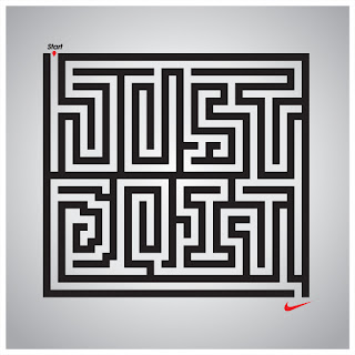
    I love his illustrated book, which is so dark and somber, but heart breakingly pretty, his type and image pieces are gorgeous, but I'm most blown away by his work for Nike in 2010, which really shows his versatility. There is so much range in his designs, and there is also a use of wit. He really retains a sense of cool masculinity in his designs, which perfectly sum up what Nike is and what the consumer is aspiring to.

    24 October 2011

    Jack Hughes' Lovely Designs


    Jack Hughes is an illustrator and designer based in London with incredible skills. His work is cool and contemporary, appealing to a very hip and youthful audience. I most love these CD covers, because they are so bold and well designed, and they explore the love heart motif in a really fun and experimental way.
    The colours and the typefaces also work well together, adding to the bold effect.

    Beautiful Things


    Gorgeous offerings from Mary Kate McDevitt

    Totally in love with the hand lettering, the beautiful colours and the prettiness and whimsy of her prints. 

    23 October 2011

    Lovely Looking Food Packaging


    I love all of this.
    Images Taken from Inspiration Feed and Design Your Way

    Monoprix Packaging Design

    Designed By Design Havas City

    Inspired by Pop Art, this is the recent food packaging redesign of French brand Monoprix. 

    The designs look modern, high impact and attractive, using strong and contrasting colours that relate to the food inside the packaging, and a typeface with a strong design edge. 

    My favourite design is the for the butter, where the use of red and yellow really stand out, and looks really fun and unique, whilst  a strong modern edge is given by the use of text and layout. 


    22 October 2011

    Retro Sainsburys

    Creative Review's blog has done a feature on the Sainsburys In House Design Team.

    There were some really cool designs that I noticed in the feature, mostly taken from the period of the 60's, 70's.


    Peter Dixon was the Head of Design, and the aesthetics of the packaging were heavily influenced by the modernist design era, made evident by the geometric shapes, the gothic, sans serif typefaces, and the simple layouts.

     I think what makes them interesting is their use of illustration and pattern, and the typefaces, which in some ways, look incredibly current, but in other ways have a definite feel of nostalgia and a retro look. The look incredibly distinctive, probably more so than any packaging available in Supermarkets now.